5. How did you attract/address your audience?
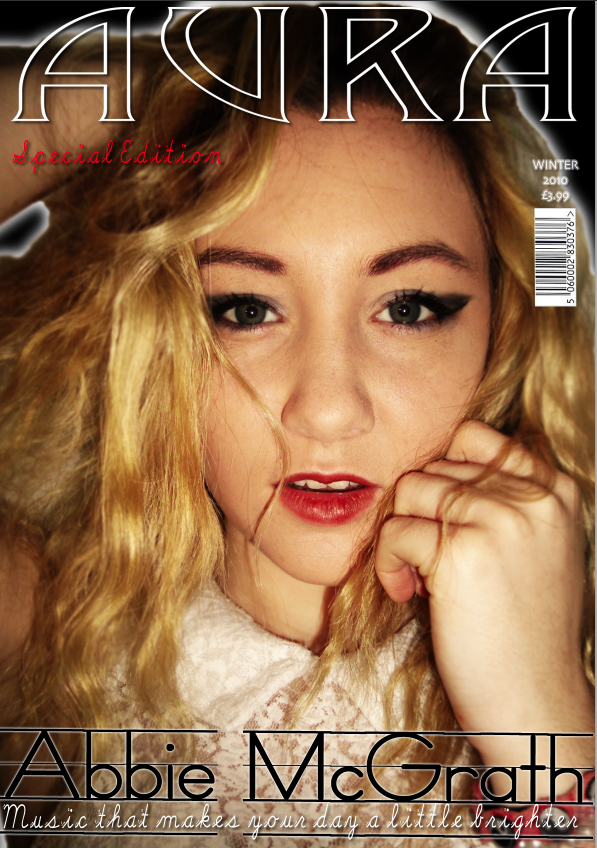
To attract my audience I have made my magazine look professional but it also has a flare of fun with the fonts and colours to appeal to everybody. I drastically changed my magazine during the processes of creating it. Originally I started with Dark red, white and black, But soon after I realised I needed to make something that was more appealing to the younger and brighter generation. so my colour scheme now sky blue, white and black when necessary.

As you can see on the images above the right looks a lot better than the left. I believe the changes made were necessary. The right cover gives the magazine a more vintage feel and attracts the target audience. I used certain conventions and imagery that I believed would appeal to the audience e.g the enhancement of the models eyes and her direct contact that pulls the readers in. The colour scheme also attracts the audience as it bold and bright- which is very relatable to the younger members of the audience.

No comments:
Post a Comment