Wednesday, 14 May 2014
Friday, 9 May 2014
Evaluation 1
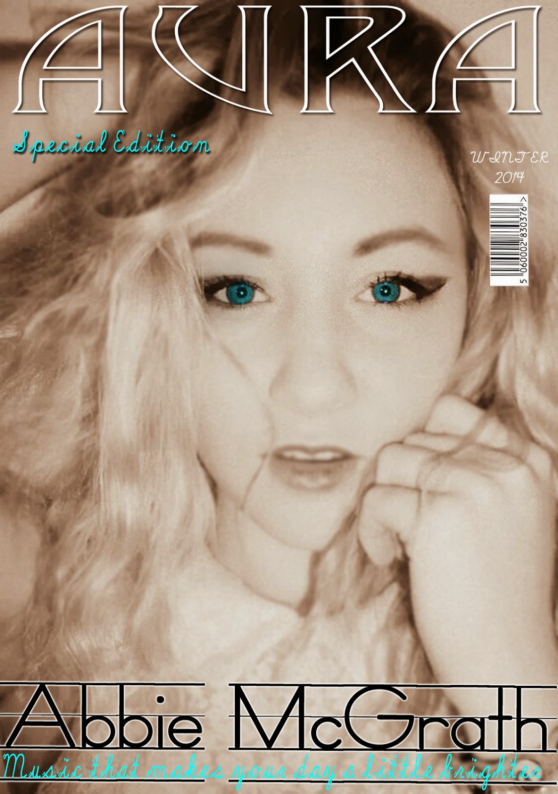 As you can see my magazine cover doesn’t have many of the
conventions that you would see on a regular magazine. This is because unlike
regular magazines mine is a specialist
magazine which focuses on one band or artist per issue.
  The mast head on my
magazine is very similar to the ‘MOJO’ style model I was using, this is because
I thought that technique was very impressive and I applied it to my own
masthead ‘AURA’. The masthead of my magazine is central, similar to MOJO.
During my research I found that magazines like ‘Q’ and ‘NME’ have their
masthead/logo in the top left corner. I personally didn’t like this idea as I
found it repetitive, especially is the logo is there on each page.
 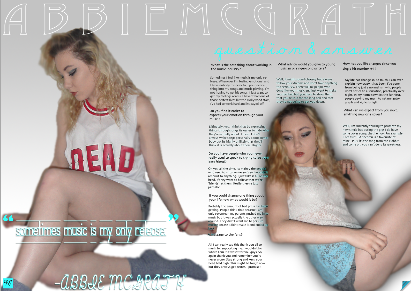 My double-page really challenges the
conventions as its is not set out the usual way. For example, compares to this
NME DPS mine looks completely different. Which was what I was aiming for in a way but i also think it makes it look a little less professional. I used pull lines from certain answers as quotes to highlight them.
My double-page really challenges the
conventions as its is not set out the usual way. For example, compares to this
NME DPS mine looks completely different. Which was what I was aiming for in a way but i also think it makes it look a little less professional. I used pull lines from certain answers as quotes to highlight them.Evaluation 2
 My magazine is a indie-rock magazine and therefore appeals to a certain social group of both genders, aged 18-21. I believe that it represents social groups in the same was as other indie-rock magazines like 'Mojo' and 'Q'. Both very popular magazines. People who class themselves as part of an 'indie' social group are all about individuality, which is what I wanted my magazine to be and therefore, appeals to individuals.
I did this by making my models dress in relatable outfits, e.g. collared shirts, denim jackets etc. The models hairs was in waves/loose curls which gave her a sort of retro 'I don't care' look which reflected the style of my target audience. I made her were very little make up, just a smokey eye effect. This was to keep it very basic and very glossy. I directed different poses for my model that I believe represent the social groups. (This image to the left isn't one that made it onto my magazine but it is a good example to use when explaining the poses).
I chose a female model as this straight away represents the female side of my target audience attracting them to the magazine, similar to this, a male might see a pretty girl and want to know more about her. So, in truth this technique attracts both genders.
I gave my magazine a colour scheme of white, blue and black. These are all very clean and clinical, this connotes that the magazine is very professional. As the colours are very basic but also well thought out, it makes my magazine seem a lot more appealing to the target audience. I have used the same house colours throughout the magazine which gives it a consistent theme.
Evaluation 3
 Bauer Media offers over 300 magazines in 15 countries, as well as online, on TV and onradio stations. As well as this, it distributes ‘MOJO’, I assume that Bauer is doing something right in order to help make the popularity of this magazine possible. Bauer will already have the target audience ready for my magazine as it is the distributor of 'MOJO' and my magazine could slot right in . Seeing as they have had experience of distributing magazines such as mine, I could be confident in the knowledge that my magazine would be distributed correctly and fairly. Bauer Media is also a multi-platform UK-based media Group therefore once my brand of magazine became established, it could be possible for them to help me to launch into other areas, such as TV and radio in the future.
- However, IPC Media produces 60 media brands and has the ability to reach out to a wide range of different audiences. research has told me that they can reach out to almost two thirds of UK women and 42% of UK men. Many of the brands they distribute are well known (for example: NME, Country Life,What’s On TV etc.). This makes me believe that they would be a good company to get involved with. Also, during my research i noticed they don't have a music magazine that covers my genre which means there is an open market for AURA. Therefore I think mymagazine could fit in well with the company. There aren’t many magazines in their range which are too similar to my own so I think it would be a good opportunity for me, as well as them, to get them on board because I would benefit form a major distributor and they would benefit from a new magazine genre which could help them to expandtheir market.

Thursday, 8 May 2014
Evaluation 4
It relates to them because of the way the magazine have been set out. The media product is rather urban and retro, using 'Valencia' filters on the images which give it a old fashioned kind of effect. There are all things the audience will notice and relate too. The genre of music its self relates to my audience as they wouldn't be wanting the magazine if they didn't like the type of music it was catering for.
Evaluation 5
Evaluation 6
constructing this product?
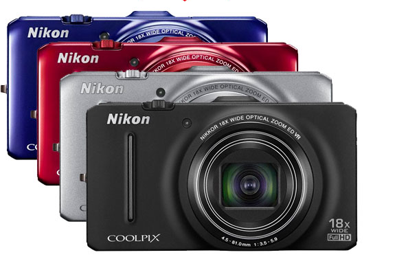 To construct my magazine I used many technologies, including a Nikon camera, Photoshop and other photo editing applications/software. I used the camera to photograph the images for my magazine, using the rule of thirds I made sure that my images were to scale before taking them and I made sure to take a couple of the same shot encase of any blur or problems with the original image.
 I then used an application to give my main cover image a filter, this made the images looked unique and stylish. After the filter was used on my images, I picked out the best ones that would attract the target audience. With the chosen image I then used photoshop. From this I had also added extra filters to suit the genre of the magazine, enhancing the eye colour on my model to make it look fresh and different.
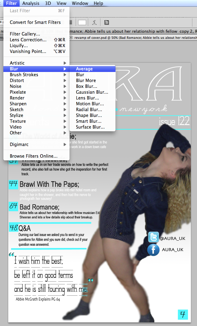
 I then continued to use the magic wand tool that cut the image out automatically. From this, the image has began to show pixelation. To fix this, I used the blur tool to blend out the skin to make is look smoother. I made sure to blur the outer edges of the hair so they didn't look jagged and badly edited.
 I used these techniques many times throughout the possess of constructing my magazine to keep the theme flowing on each page. The text was used by photoshop as well as it was only a simple text that I needed. All the fonts used were from the photoshop software.
Evaluation 7
 To start with I already had a basic knowledge of Photoshop but since I began to construct my magazine I have noticed a considerable increase in my skills. I now have a deeper understanding of how to use specific tools and features, such as filters and the blur tool. I have learnt how to blend images into the background. An example of this would be on the images used for the DPS and contents page, by blurring the around the images it made the lines look less sharp.
 I feel as though I have gained a wide variety of techniques since completing the preliminary task because I have researched more style models and include more conventions such as quotes and tag lines. My prelim task lacked theses features and therefore doesn't look as professional as my finished music magazine. The images taken for the preliminary task seemed rushed and lacking structure, something I aimed to improve upon when taking my final images.
Thursday, 3 April 2014
Tuesday, 1 April 2014
Ideas
Thursday, 6 March 2014
Feedback
 For example; Some text was difficult to read due to its layout or because the colour blended with the background. I have improved this by making the font bolder and duplicating the layer on Photoshop which gives the text definition and texture. I also changed the font to something more readable.
Wednesday, 5 March 2014
Additional Editing.
Even though I have already edited images for my magazine, I still have fun messing around withother styles that I think might look good if I add in the conventions.
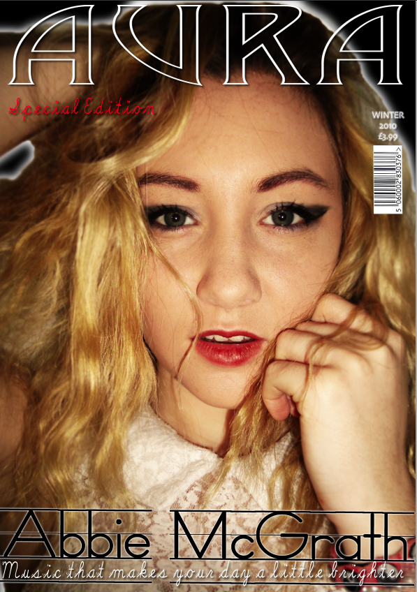
Here is one of my edits, it's not much, I've coloured the eyes so they stand out more and the image has a white filter which makes it look clean. Personally I think this image looks better than the one used in my cover and might make a draft cover using this image...
Tuesday, 4 March 2014
Additional PhotoShoot
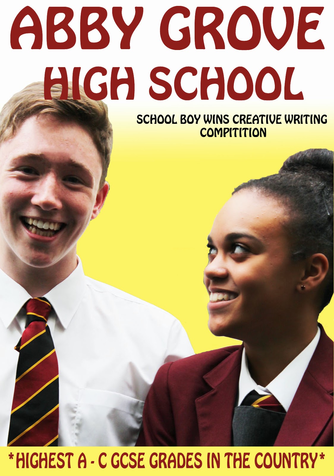
I am planning on taking a secondary photoshoot with either the same or different models. I have decided to do this because although my magazine is a specialist addition (focused on one person) I want to add photographs which can be used as advertisements for past issues, which gives my magazine more definition.
I have decided to get a male model to even the boat since all my previous images only contain one female model. This will balance out and fit the male/female audience criteria, which was something I was previously lacking.
I have planned for the images to take place in the school hall, which gives a blank canvas for editing. This factor will give me an edge as it will be easier for me to manipulate the images to the way I want by using photoshop.
Friday, 14 February 2014
Monday, 10 February 2014
Double Page Spread
Double Page Spread
There are obviously a lot of things i could improve on this and I am not entirely happy with the way it has turned out. Like I said I am happy to improvements.
Monday, 3 February 2014
Discuss ways waterloo road constructs the representation of teenagers.
Discuss ways waterloo road constructs the representation of teenagers.
Later on in the episode Brett is shown speaking to one of the other teachers, Miss Campbell, pastoral care. He opens up to her about his dad, saying why he ‘hates’ him. In this scene we see a broken, hurt Brett and the camera angles and lighting reflect this. There is a softer light in this scene, which helps the atmosphere and the camera angles are mainly medium close ups of Brett, showing us the strong emotions he has. This scene gives the audience more of an insight onto rich boy Brett’s life.
Mika is also in a lot of scenes with Brett and this makes us see the connection between them as Brett flirts with her a lot. Even though he’s trying to also get with Davina, this makes Brett a kid of a player. This is relatable to a lot of teenage boys these days so this is a fair point.
I think that some techniques used in the show are rather good, like the music that flows through scenes and transitions. Though sometimes it is a little loud and you cannot hear the dialogue over it.
I wouldn’t say that the representation is up to date because the fashion and furnishings are a little out of date but I would say the representation of the class rooms and the school is extremely believable.


