
Wednesday, 14 May 2014


Friday, 9 May 2014
Evaluation 1
1.
In
what way does your media product use, develop or challenge forms and
conventions of real media products?
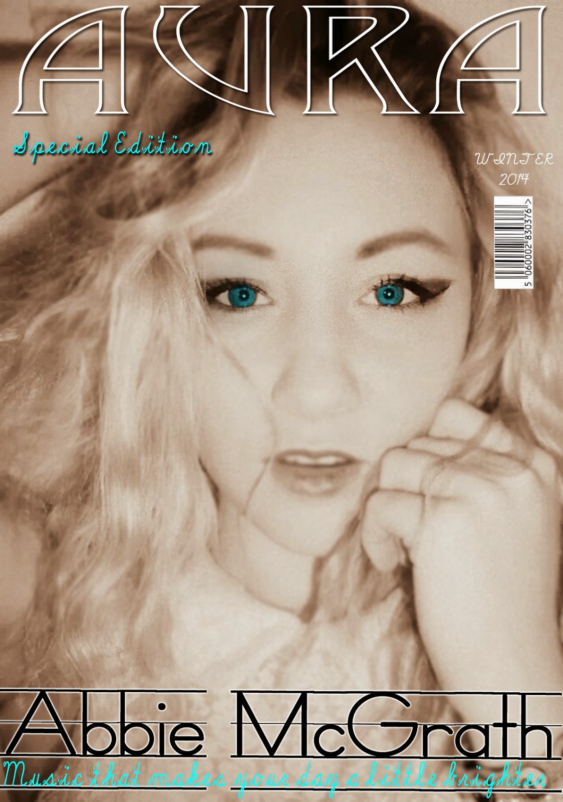 As you can see my magazine cover doesn’t have many of the
conventions that you would see on a regular magazine. This is because unlike
regular magazines mine is a specialist
magazine which focuses on one band or artist per issue.
As you can see my magazine cover doesn’t have many of the
conventions that you would see on a regular magazine. This is because unlike
regular magazines mine is a specialist
magazine which focuses on one band or artist per issue.
This cover is for an indie-rock artist and
therefore I have built up my magazine to make it look as individual as
possible. By using a white filter as a base colour on my image I could enhance
the eye colour making them a bright blue colour that links with the text used.
I have also blurred around the face making it look softer and they eyes more
prominent. This entices the reader as it is different and something that isn’t
used with every magazine.
As my magazine is a specialist issue it
challenges to normal conventions by not using many. For example, I don’t use
pull lines on the front covers, this is because all the stories relate to one
artist and the reader already knows this. I don’t completely throw the idea of
conventions out of the window though. I do have common conventions such as a
tag line and barcode.
 The mast head on my
magazine is very similar to the ‘MOJO’ style model I was using, this is because
I thought that technique was very impressive and I applied it to my own
masthead ‘AURA’. The masthead of my magazine is central, similar to MOJO.
During my research I found that magazines like ‘Q’ and ‘NME’ have their
masthead/logo in the top left corner. I personally didn’t like this idea as I
found it repetitive, especially is the logo is there on each page.
The mast head on my
magazine is very similar to the ‘MOJO’ style model I was using, this is because
I thought that technique was very impressive and I applied it to my own
masthead ‘AURA’. The masthead of my magazine is central, similar to MOJO.
During my research I found that magazines like ‘Q’ and ‘NME’ have their
masthead/logo in the top left corner. I personally didn’t like this idea as I
found it repetitive, especially is the logo is there on each page.
The layout of my magazine cover photo was
extremely important as I took inspiration from the ‘MOJO’ cover and in some
aspects I have mimicked it. For example the tagline and main cover line are
both placed at the bottom of the page. This is because of the close up image of
the models face— if the text was in the centre of the page it would block out
certain aspects and draw the attention away from the eyes, which is where I
wanted it to be.


My contents page was also modeled from a
‘MOJO’ magazine but not the same issue. As you can see this contents page
contains Florence Welsh (left) . I have adapted my contents page to match its
format and have tried to get the layout at an equal balance. (right). Compared
to each other they are very similar, despite the changes in font and colour. I
kept the contents page relatively simple because from my research I have found
that simplicity the best. I made sure it had a clear and logical structure. I
tried my best to make sure all the text was formatted correctly. The image used on the contents is the same
model as before as the magazine is all about her. The house colours flow
throughout the magazine, which makes the magazine, seem more professional.

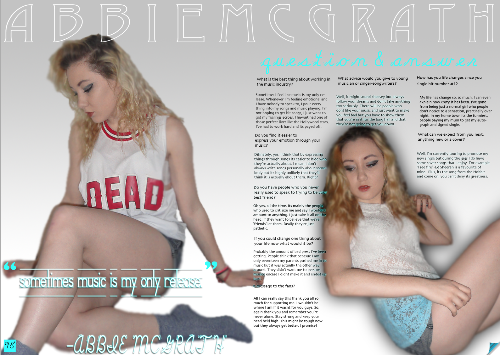 My double-page really challenges the
conventions as its is not set out the usual way. For example, compares to this
NME DPS mine looks completely different. Which was what I was aiming for in a way but i also think it makes it look a little less professional. I used pull lines from certain answers as quotes to highlight them.
My double-page really challenges the
conventions as its is not set out the usual way. For example, compares to this
NME DPS mine looks completely different. Which was what I was aiming for in a way but i also think it makes it look a little less professional. I used pull lines from certain answers as quotes to highlight them.
The written content in my magazine was very important to me and i wanted to make sure it was qualitative but also not to much of it that the reader would get bored. I thought that it was very simple to write an question and answer article because I thought of both questions and answers.
The genre of my magazine was indie-rock music which is one of my favourite styles of music which means I was very aware of what it entitled. I knew the type of images and colour scheme that would compliment the genre well. I looked at magazines such as rock sound and q, along with mojo. They all gave me basic ideas of what I wanted for my magazine and I specifically decided to challenge the conventions by creating a specialist magazine.
Evaluation 2
Evaluation 2: How does your media product represent particular social groups?
 My magazine is a indie-rock magazine and therefore appeals to a certain social group of both genders, aged 18-21. I believe that it represents social groups in the same was as other indie-rock magazines like 'Mojo' and 'Q'. Both very popular magazines. People who class themselves as part of an 'indie' social group are all about individuality, which is what I wanted my magazine to be and therefore, appeals to individuals.
I did this by making my models dress in relatable outfits, e.g. collared shirts, denim jackets etc. The models hairs was in waves/loose curls which gave her a sort of retro 'I don't care' look which reflected the style of my target audience. I made her were very little make up, just a smokey eye effect. This was to keep it very basic and very glossy. I directed different poses for my model that I believe represent the social groups. (This image to the left isn't one that made it onto my magazine but it is a good example to use when explaining the poses).
I chose a female model as this straight away represents the female side of my target audience attracting them to the magazine, similar to this, a male might see a pretty girl and want to know more about her. So, in truth this technique attracts both genders.
I gave my magazine a colour scheme of white, blue and black. These are all very clean and clinical, this connotes that the magazine is very professional. As the colours are very basic but also well thought out, it makes my magazine seem a lot more appealing to the target audience. I have used the same house colours throughout the magazine which gives it a consistent theme.
Evaluation 3
2. What type of media institution would distribute your media product and why?
 Bauer Media offers over 300 magazines in 15 countries, as well as online, on TV and onradio stations. As well as this, it distributes ‘MOJO’, I assume that Bauer is doing something right in order to help make the popularity of this magazine possible. Bauer will already have the target audience ready for my magazine as it is the distributor of 'MOJO' and my magazine could slot right in . Seeing as they have had experience of distributing magazines such as mine, I could be confident in the knowledge that my magazine would be distributed correctly and fairly. Bauer Media is also a multi-platform UK-based media Group therefore once my brand of magazine became established, it could be possible for them to help me to launch into other areas, such as TV and radio in the future.
- However, IPC Media produces 60 media brands and has the ability to reach out to a wide range of different audiences. research has told me that they can reach out to almost two thirds of UK women and 42% of UK men. Many of the brands they distribute are well known (for example: NME, Country Life,What’s On TV etc.). This makes me believe that they would be a good company to get involved with. Also, during my research i noticed they don't have a music magazine that covers my genre which means there is an open market for AURA. Therefore I think mymagazine could fit in well with the company. There aren’t many magazines in their range which are too similar to my own so I think it would be a good opportunity for me, as well as them, to get them on board because I would benefit form a major distributor and they would benefit from a new magazine genre which could help them to expandtheir market.

Subscribe to:
Comments (Atom)