Thursday, 8 May 2014

Evaluation 4

4. Who would be the audience for your media product?

I have developed my magazine so that it relates to the older audience members, rather than the event and festival aimed audience, despite my article being about a young musician, this is because I believe it is vital to bring the generations together. This audience that I am aiming for consists of both male and females, from 18 years old all the way up to 21. As I think that people grow out of the musical genres they enjoyed at an earlier age.

I also have tried my best to use colour scheme to fit in with the audience themes keeping to brighter shades of blue and using white and black where is necessary to make things look professional and appeal to an older audience but a lot of my headings and fonts are also kept stylised and fresh to keep it appealing to the younger generations. 

It relates to them because of the way the magazine have been set out. The media product is rather urban and retro, using 'Valencia' filters on the images which give it a old fashioned kind of effect. There are all things the audience will notice and relate too. The genre of music its self relates to my audience as they wouldn't be wanting the magazine if they didn't like the type of music it was catering for.

Evaluation 5

5. How did you attract/address your audience?

To attract my audience I have made my magazine look professional but it also has a flare of fun with the fonts and colours to appeal to everybody. I drastically changed my magazine during the processes of creating it. Originally I started with Dark red, white and black, But soon after I realised I needed to make something that was more appealing to the younger and brighter generation. so my colour scheme now sky blue, white and black when necessary.

 
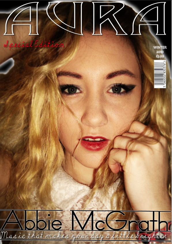
                       (Before)                                                                                      (After)

As you can see on the images above the right looks a lot better than the left. I believe the changes made were necessary. The right cover gives the magazine a more vintage feel and attracts the target audience. I used certain conventions and imagery that I believed would appeal to the audience e.g the enhancement of the models eyes and her direct contact that pulls the readers in. The colour scheme also attracts the audience as it bold and bright-  which is very relatable to the younger members of the audience.

Evaluation 6

What have you learnt about technologies from the process of
constructing this product?


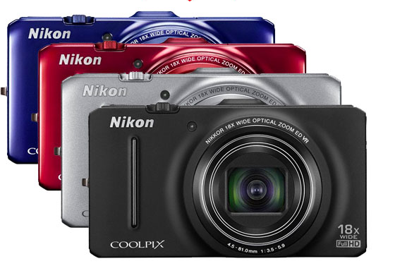
To construct my magazine I used many technologies, including a Nikon camera, Photoshop and other photo editing applications/software. I used the camera to photograph the images for my magazine, using the rule of thirds I made sure that my images were to scale before taking them and I made sure to take a couple of the same shot encase of any blur or problems with the original image.


I then used an application to give my main cover image a filter, this made the images looked unique and stylish. After the filter was used on my images, I picked out the best ones that would attract the target audience. With the chosen image I then used photoshop. From this I had also added extra filters to suit the genre of the magazine, enhancing the eye colour on my model to make it look fresh and different.

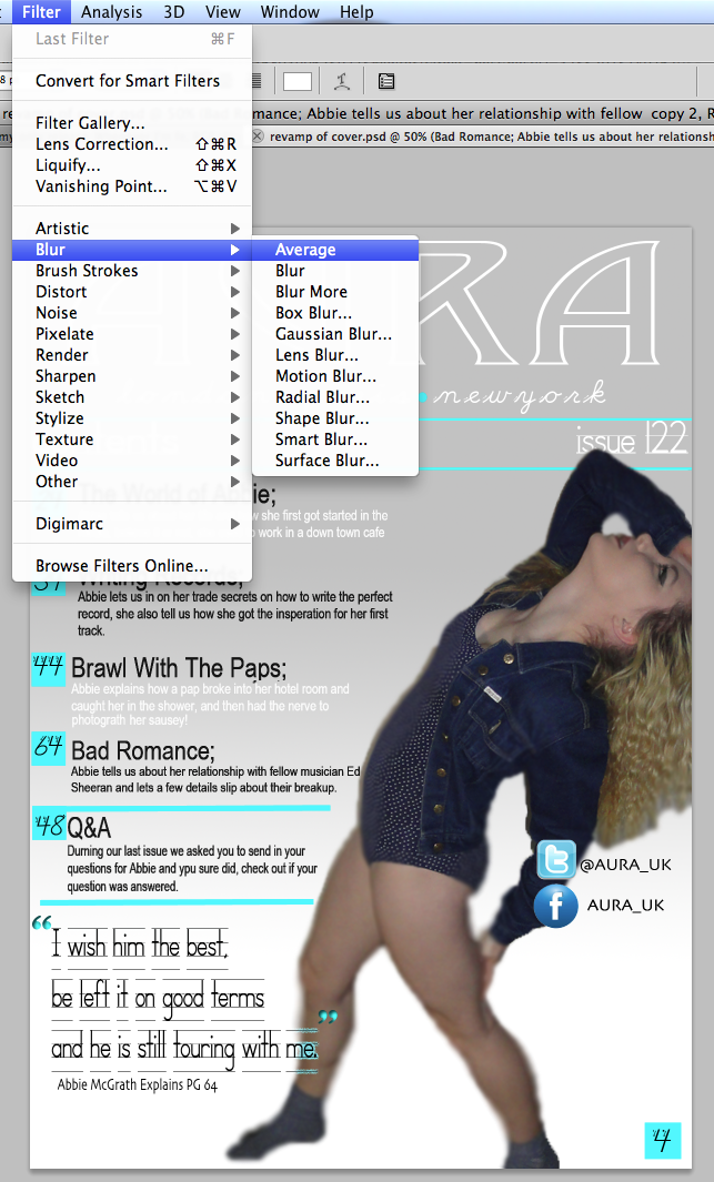
I then continued to use the magic wand tool that cut the image out automatically. From this, the image has began to show pixelation. To fix this, I used the blur tool to blend out the skin to make is look smoother. I made sure to blur the outer edges of the hair so they didn't look jagged and badly edited. 


I used these techniques many times throughout the possess of constructing my magazine to keep the theme flowing on each page. The text was used by photoshop as well as it was only a simple text that I needed. All the fonts used were from the photoshop software.

Evaluation 7

7. Looking back at your preliminary task, what do you feel you have learnt in the progression from it to the full product?


To start with I already had a basic knowledge of Photoshop but since I began to construct my magazine I have noticed a considerable increase in my skills. I now have a deeper understanding of how to use specific tools and features, such as filters and the blur tool. I have learnt how to blend images into the background. An example of this would be on the images used for the DPS and contents page, by blurring the around the images it made the lines look less sharp.

I feel as though I have gained a wide variety of techniques since completing the preliminary task because I have researched more style models and include more conventions such as quotes and tag lines. My prelim task lacked theses features and therefore doesn't look as professional as my finished music magazine. The images taken for the preliminary task seemed rushed and lacking structure, something I aimed to improve upon when taking my final images.

I believe my understanding of software's has improved greatly throughout the course. Photoshop is a complex and time consuming application, It takes time and effort to master but once I got a grasp on what I was doing I found it getting easier to understand.

Thursday, 3 April 2014

Before and After


Before & After


So, I changed the DPS this is before.

And this is after.


Tuesday, 1 April 2014

Ideas

So I have decided to revamp my magazine, changing the cover and contents so far with a different house style and i think this one is a lot better.. Feel free to leave feedback!

This is theN new cover that I have made up. I changed the red tto blue and lightened the filter on the image making the whole thing seem a lot brighter


I have done the same with the contents page making it look slicker and professional.


Thursday, 6 March 2014

Feedback

Feedback
I posted the images of my magazine cover, contents page and double-page spread on social media sites to receive both audience and peer feedback.
The feedback I received was mainly positive and some constructive criticism which I have took in to consideration and improved upon.
For example; Some text was difficult to read due to its layout or because the colour blended with the background. I have improved this by making the font bolder and duplicating the layer on Photoshop which gives the text definition and texture. I also changed the font to something more readable.